Mastodon Josh – Josh Hrach

Creating a Menu Button with Subtitles in SwiftUI

SwiftUI menus are extremely useful. When you are showing a Button in a Menu, there are a few ways to style it. However, it may not always be obvious.

For example, let’s say I want to replicate the appearance of this button in the Contacts app. It has a title, a subtitle, and a trailing icon image.

At first glance, you may build something like this:

Menu {
    Button { /* Action */ } label: {
        HStack  {
            VStack {
                Text("work")
                Text("an.email@address.com")
            }
            Image(systemName: "envelope")
        }
    }
} label: { /* The "mail" button */ }

However, you’ll quickly see that this is not correct.

While your label in normal circumstances might appear as you’d expect, the menu’s buttons seem to work by mirroring the underlying content. We can imply this by the way the image appears at the trailing edge of the button and not next to the text like our (misaligned?) HStack would suggest.

We see similar behavior if we change our button’s label to use an actual Label type.

Label(
    title: {
        Text("work")
        Text("an.email@address.com")
    },
    icon: { Image(systemName: "envelope") }
)

Again, we see the same output as above.

So what can we do differently? If the image is “magically” being picked out and put in the right place, then perhaps there’s other magic happening in the Button. In fact, this turns out to be what is happening. Let’s update our button once more:

Button { /* Action */ } label: {
    Text("work")
    Text("an.email@address.com")
    Image(systemName: "envelope")
}

Now we’re not specifying anything about text layout or even where the image should appear. Yet, what is our result?

There is definitely some underlying mirroring happening to pull out each view and put them in their proper place. In fact, if you were to put the Image before the second Text view, you end up with the same output! Thus, this does appear to be what is happening.

In short, if you want to have your menu’s button appear like a contact’s mail or phone buttons, use the following template:

Button { /* Action */ } label: {
    Text("Title")
    Text("Subtitle")
    Image(systemName: /* The icon */)
}

UIViewRepresentable: Accessing an underlying view

In the first post of this series, we looked at how we can display a UIView in a SwiftUI hierarchy, as well as how we can change properties on said view. In the second post, we explored options for exposing this view’s delegate to our SwiftUI view, allowing us to provide both an object to act as delegate as well as a way to respond to the delegate directly in the SwiftUI view.

Our demo code is presently:

class ThirdPartyUIView: UIView {
    var shouldAdd: Bool = true
    var delegate: ThirdPartyViewDelegate?
    
    // Same as button tap in view. Results reported via delegate
    func changeInternalValue() { /*...*/ }
}

struct ThirdPartyViewRepresentable: UIViewRepresentable {
    var delegate: ThirdPartyViewDelegate? = nil
    var shouldAdd: Bool
    
    func makeUIView(context: Context) -> ThirdPartyUIView {
        let view = ThirdPartyUIView()
        view.shouldAdd = shouldAdd
        view.delegate = delegate
        return view
    }
    
    func updateUIView(_ uiView: ThirdPartyUIView, context: Context) {
        uiView.shouldAdd = shouldAdd
    }
}

struct ThirdPartyView: View {
    var shouldAdd: Bool
    @State private var coordinator = ThirdPartyCoordinator()
    
    var body: some View {
        ThirdPartyViewRepresentable(delegate: coordinator, shouldAdd: shouldAdd)
    }
}

struct ThirdPartyDemoView: View {
    @State private var shouldAdd = true
    @State private var currentValue = 0
    
    var body: some View {
        Text("\(currentValue)")
        ThirdPartyView(shouldAdd: shouldAdd)
            .viewChangedValueTo { view, newValue in
                currentValue = newValue
            }
        Toggle("Add?", isOn: $shouldAdd)
        Button("Perform Action") {
            // ???
        }
    }
}

What does our Button‘s action need to be for us to trigger the ThirdPartyUIView.changeInternalValue() method?

There’s several ways we can solve this. One approach might be to have something trigger the action in the view representable’s updateUIView(_:context:) method. As noted in part one, updating the property on the UIViewRepresentable will trigger that method, so we just need to add properties for that to happen. So we could add a new @State boolean that is passed from our view down into the view representable, and when its value changes, we perform the action. However, this leaves us with a few oddities: To trigger the action, our button has to… toggle a Bool, which is not very obvious; Other developers might be confused as to what its purpose is. It also means that performing actions on the view requires changing state, which isn’t exactly why we have declarative UI frameworks like SwiftUI.

Instead of adding additional (and potentially confusing) state to our views to trigger actions, we really want our button to be able to just call the action that needs to be done. But that requires the action to be exposed in such a way that the Button can access it despite the action and its view living within another view. How can we expose that action in a way that the Button can trigger it? We’ll look at a few first party examples from SwiftUI. First, though, let’s look at how information is passed in SwiftUI.

Two-Way Communication

Normally we pass information from one view to the next by means of the view’s initializer. For instance, providing an initial value for shouldAdd in our example is part of the call site.

ThirdPartyView(shouldAdd: shouldAdd)

What if we needed to pass information down through multiple layers of views? That’s where the environment comes into play.

There are two ways of passing information down through the environment.1 The first is by passing in an EnvironmentObject. Essentially, by providing a class object conforming to ObservableObject, you can then listen for said object in a sub-view.

// Creating your object
class SomeObject: ObservableObject { }
let yourObject = SomeObject()

...

// Adding it to the environment of some view
SomeSwiftUIView()
    .environmentObject(yourObject)


struct SomeSwiftUIView: View {
    // Retrieving object from enviroment
    @EnvironmentObject private var yourObject: SomeObject
}

The second way is by means of EnvironmentValues. This struct is used anytime you pull information from the environment. Here are a few things you can get from the environment in SwiftUI.

@Environment(\.colorScheme) var colorScheme
@Environment(\.dynamicTypeSize) var typeSize

The Environment wrapper takes a key path to a property on EnvironmentValues. The property we create as a var inherits its type from the property the key path points to. In these examples, both colorScheme and dynamicTypeSize are just properties exposed on the EnvironmentValues struct.

So the environment is used to pass data down the hierarchy. How can we pass information up? That is by means of Preferences.

Whereas you use the environment to configure the subviews of a view, you use preferences to send configuration information from subviews toward their container. However, unlike configuration information that flows down a view hierarchy from one container to many subviews, a single container needs to reconcile potentially conflicting preferences flowing up from its many subviews.

Apple Documentation

To pass information via Preferences, one needs to create a struct conforming to PreferenceKey. This is a named value that is produced by the view. Part of the creation of the PreferenceKey is resolving multiple values for that key into a single value. That single value can then be used by a parent container view.

Now that we’ve checked out the ways we can communicate up and down a SwiftUI view hierarchy, there’s one more thing SwiftUI can teach us. Are there any examples of exposing underlying functionality to a parent container? The answer is actually yes.

Proxies

While the debate of UIKit versus SwiftUI continues among developers, many often forget one simple truth: SwiftUI is quite often just utilizing UIKit under the hood. This is why development techniques that manipulate underlying UIKit views are possible.

This truth, however, leads many to say that SwiftUI is lacking because things that are possible in UIKit are simply not exposed. This is true for elements where tasks might be trigger programmatically but are difficult to describe as a function of state. Let’s consider the ScrollView.

ScrollView {
    Text("First").id(1)
    Text("Second").id(2)
    Text("Third").id(3)
}

A ScrollView tells us to put its contents inside of, well, a scroll view. When we create it, we can tell it which axis to scroll on. However, UIScrollView in UIKit does more than that; it allows programmatic scrolling! How did Apple end up adding that functionality?

Introducing the ScrollViewReader.

ScrollViewReader { proxy in
    ScrollView {
        Text("First").id(1)
        Text("Second").id(2)
        Text("Third").id(3)
    }
}

The sole purpose of the ScrollViewReader is to expose functionality of underlying scroll views, in this case the ability to scroll to a particular view. It does so by means of a proxy object. We pass that proxy the ID of the object we want to scroll to.

ScrollViewReader { proxy in
    ScrollView {
        Text("First").id(1)
        Text("Second").id(2)
        Text("Third").id(3)
        Button("Scroll To Top") {
            proxy.scrollTo(1)
        }
    }
}

If we need to have programmatic control, we use the ScrollViewReader. If we just need a ScrollView without that, we can ignore it. Can we create something similar for our example? Could we end up with something like this?

ThirdPartyReader { proxy in 
    ThirdPartyView()
    Button("Perform Action") {
        proxy.changeInternalValue()
    }
}

Creating a Proxy and a Reader

To achieve our goal, we need to create a few new objects. First, our proxy. This object’s purpose is to expose functionality of the ThirdPartyUIView without exposing the entire view itself. The design is fairly simple. 2

class ThirdPartyProxy {
    fileprivate weak var view: ThirdPartyUIView?
    
    func changeInternalValue() {
        view?.changeInternalValue()
    }
}

Our proxy has a single method, changeInternalValue(). If there were other functions of ThirdPartyUIView that we’d want to expose, we would add them here.

Now, how will we expose the proxy? We’ll copy the above example and build our own “reader” object.

struct ThirdPartyReader<Content: View>: View {
    private var content: (ThirdPartyProxy) -> Content
    
    init(@ViewBuilder _ content: @escaping (ThirdPartyProxy) -> Content) {
        self.content = content
    }
    
    var body: some View {
        content(proxy)
    }
}

The ThirdPartyReader‘s purpose is to provide a proxy instance to our view content. It’s a very simple container! However, how will we get the proxy? And how will the proxy get the view?

Here, there are 2 approaches we could take: (1) We can pass the view or its actions up through Preferences to this container, or (2) pass an object into the Environment that captures what we need.

For now, we’ll go with option 2. Option 1 is definitely possible but has its own quirks. If you build a good example using it, I’d love to hear about it!

Getting the View for Our Proxy

We’re working down through the hierarchy in the Environment. Thus, we start by creating a proxy instance in our new reader.

struct ThirdPartyReader<Content: View>: View {
    @StateObject private var proxy = ThirdPartyProxy()

Note that we’re creating this as a StateObject. Our reader is thus owning the instance of this object. However, using this property wrapper requires our proxy conform to ObservableObject. We’ll do so as precedent as a proxy might benefit from having @Published properties depending on the view being wrapped.

With the proxy created and owned by this view, we now pass it into the Environment. However, we’re not just passing it using .environmentObject. Doing so would create a tight requirement for any child view, where we must provide a proxy even if we’re not in a reader.

Instead, we’ll make use of the EnvironmentValues.

extension EnvironmentValues {
    private struct ThirdPartyProxyEnvironmentKey: EnvironmentKey {
        static var defaultValue: ThirdPartyProxy? = nil
    }
    
    var thirdPartyProxy: ThirdPartyProxy? {
        get { self[ThirdPartyProxyEnvironmentKey.self] }
        set { self[ThirdPartyProxyEnvironmentKey.self] = newValue }
    }
}

We first create a new EnvironmentKey. It tells us the type to be passed into the environment which will be an optional ThirdPartyProxy. By default, it’ll be nil, which means no proxy exists in the environment.

We’ll use the above to pass our new proxy into the environment of the reader’s view.

var body: some View {
    content(proxy)
        .environment(\.thirdPartyProxy, proxy)
}

Now, any view content provided to the reader container will find a proxy object in the environment. We can now check the environment in our ThirdPartyView and update our view representable to set the view on that proxy.

struct ThirdPartyViewRepresentable: UIViewRepresentable {
    @State private var actionTriggered = false
    
    var delegate: ThirdPartyViewDelegate? = nil
    var proxy: ThirdPartyProxy?
    var shouldAdd: Bool
    
    func makeUIView(context: Context) -> ThirdPartyUIView {
        let view = ThirdPartyUIView()
        view.shouldAdd = shouldAdd
        view.delegate = delegate
        proxy?.view = view
        return view
    }
    
    func updateUIView(_ uiView: ThirdPartyUIView, context: Context) {
        uiView.shouldAdd = shouldAdd
    }
}
struct ThirdPartyView: View {
    @Environment(\.thirdPartyProxy) private var proxy
    
    var shouldAdd: Bool
    @State private var coordinator = ThirdPartyCoordinator()
    
    var body: some View {
        ThirdPartyViewRepresentable(delegate: coordinator, proxy: proxy, shouldAdd: shouldAdd)
    }
}

With the above changes, we’ve added the last piece and have enabled our SwiftUI views to access underlying methods of our wrapped UIView. Our fully functional sample view now looks like this:

struct ThirdPartyDemoView: View {
    @State private var shouldAdd = true
    @State private var currentValue = 0
    
    var body: some View {
        ThirdPartyReader { proxy in
            Text("\(currentValue)")
            ThirdPartyView(shouldAdd: shouldAdd)
                .viewChangedValueTo { view, newValue in
                    currentValue = newValue
                }
            Toggle("Add?", isOn: $shouldAdd)
            Button("Perform Action") {
                proxy.changeInternalValue()
            }
        }
    }
}

In these posts, we’ve looked at how we can fully use a UIView within a SwiftUI hierarchy. To do so, we’ve simply used what Apple has provided since SwiftUI was introduced with iOS 13. And while SwiftUI might be the future of building apps, it will likely continue to be built on top of UIKit, and UIKit likely has a long future ahead of it. Being able to work with UIKit in SwiftUI is just another tool in our ever growing toolbox as developers on Apple platforms.

The full sample code is available as a Github Gist.

  1. When speaking about the environment and its usage, I’ll be referring to APIs and terminology from before iOS 17. iOS 17 has made some changes to Environment and includes the new Observable framework, neither of which I’ll be discussing here. ↩︎
  2. This variable is declared as fileprivate just so that the view property is exposed to the other classes in this file but not to the consumers of the API we’re building. If you’re adding this into a framework or library, then keeping this property internal while making the functions you add public will satisfy this requirement, too.

    We also make this weak so that it doesn’t retain the view it is referencing. ↩︎

UIViewRepresentable: Working with delegates in SwiftUI

In the first post of this series, we looked at how we can display a UIView in a SwiftUI hierarchy, as well as how we can change properties on said view. As a refresher, here is our example.

Imagine we have a third party SDK that provides their functionality in a pre-packaged UIView subclass. We’ll call this ThirdPartyUIView. It has properties set on it to change its behavior, methods that can be called on it, and provides internal feedback by means of a delegate object.

class ThirdPartyUIView: UIView {
    var shouldAdd: Bool
    var delegate: ThirdPartyViewDelegate?
    
    // Same as button tap in view. Results reported via delegate
    func changeInternalValue() { /*...*/ }
}

protocol ThirdPartyViewDelegate {
    func view(_ view: ThirdPartyUIView, changedValueTo newValue: Int)
}

And here is our UIViewRepresentable view thus far.

struct ThirdPartyViewRepresentable: UIViewRepresentable {
    var shouldAdd: Bool
    
    func makeUIView(context: Context) -> ThirdPartyUIView {
        let view = ThirdPartyUIView()
        view.shouldAdd = shouldAdd
        return view
    }
    
    func updateUIView(_ uiView: ThirdPartyUIView, context: Context) {
        uiView.shouldAdd = shouldAdd
    }
}

How can we provide a delegate when creating our view? Let’s look at a few approaches.

The Coordinator

The UIViewRepresentable protocol gives us one approach that we can take. The clue is found in the Context object that is provided in both the makeUIView(context:) and updateUIView(_:context:) methods. It has a coordinator property of type Coordinator. But what is this type?

Here is how it is defined in the UIViewRepresentable protocol:

/// A type to coordinate with the view
associatedtype Coordinator = Void

By default, Coordinator is type Void, essentially meaning an empty type. It is provided to the Context by means of the protocol method makeCoordinator(). By providing our own type here, we can create an object that will coordinate with the view.

Let’s use that to create a type conforms to the ThirdPartyViewDelegate protocol. We can then create an instance of it and provide it when we initialize our view.

struct ThirdPartyViewRepresentable: UIViewRepresentable {
    class Coordinator: ThirdPartyViewDelegate {
        func view(_ view: ThirdPartyUIView, changedValueTo newValue: Int) {
            // Respond to newValue
        }
    }
    
    var shouldAdd: Bool
    
    func makeUIView(context: Context) -> ThirdPartyUIView {
        let view = ThirdPartyUIView()
        view.shouldAdd = shouldAdd
        view.delegate = context.coordinator
        return view
    }
    
    func updateUIView(_ uiView: ThirdPartyUIView, context: Context) {
        uiView.shouldAdd = shouldAdd
    }
    
    func makeCoordinator() -> Coordinator {
        Coordinator()
    }
}

Just like that, we’ve been able to define and provide a delegate that can respond to changes to the ThirdPartyUIView!

However, we have some limitations here. First, this means that the delegate is defined and created entirely within the ThirdPartyViewRepresentable. There isn’t any way to provide a different delegate. We also have no way to allow this delegate to interface with other elements, such as some kind of UI within our SwiftUI hierarchy. How can we allow that?

Injecting a Delegate

The simplest way is by creating our delegate class outside of the view representable and providing an instance of it when we initialize the view.

class OurDelegate: ThirdPartyViewDelegate {
    func view(_ view: ThirdPartyUIView, changedValueTo newValue: Int) {
        // Respond to newValue
    }
}

struct ThirdPartyViewRepresentable: UIViewRepresentable {
    var delegate: ThirdPartyViewDelegate? = nil
    var shouldAdd: Bool
    
    func makeUIView(context: Context) -> ThirdPartyUIView {
        let view = ThirdPartyUIView()
        view.shouldAdd = shouldAdd
        view.delegate = delegate
        return view
    }
    
    func updateUIView(_ uiView: ThirdPartyUIView, context: Context) { ... }
}

Now, when we make use of the view representable, we have the option of providing a delegate.

struct ThirdPartyDemoView: View {
    @State private var shouldAdd = true
    private let delegate = OurDelegate()
    
    var body: some View {
        ThirdPartyViewRepresentable(delegate: delegate, shouldAdd: shouldAdd)
        Toggle("Add?", isOn: $shouldAdd)
    }
}

This is great because we can provide any delegate we want for the underlying view. If we use this view in multiple places or in multiple projects, we can create a different delegate based on each situation. However, we still don’t have a way for these updates to be exposed in our SwiftUI view. For instance, what if we wanted a Text view to display the new value? How could we change our view to support that?

To answer, let’s first take a step back and consider how we might want our code to be written.

Planning Our API

As we build our own implementations, it’s sometimes helpful to look at existing first party code. For example, let’s look at how SwiftUI exposes various actions that we can respond do.

One example is .onAppear(perform:), which lets us declare a closure that is called when the view appears. This sounds like what we want to emulate. Providing a closure of our own to perform when a delegate method is invoked would be a good way to hook into the delegate while letting us access the data in our SwiftUI view. So our destination is something like this:

// What we'd like to build
ThirdPartyView()
    .viewChangedValueTo { thirdPartyView, newValue in 
        // Use newValue to update some state in our view
        // Access thirdPartyView if necessary
    }

What do we need to do to create the above?

To begin, let’s first add another layer of abstraction around our view representable.

struct ThirdPartyView: View {
    var shouldAdd: Bool
    
    var body: some View {
        ThirdPartyViewRepresentable(delegate: ???, shouldAdd: shouldAdd)
    }
}

Like before, we will initialize this view with a shouldAdd property so we can control it externally. But what about our delegate? What should we put there? We’ll need to create a class that can act as a ThirdPartyViewDelegate that takes the data from the delegate method and forwards it to a closure that we define.

class ThirdPartyCoordinator: ThirdPartyViewDelegate {
    var viewChangedValueTo: ((ThirdPartyUIView, Int) -> Void)?
    
    func view(_ view: ThirdPartyUIView, changedValueTo newValue: Int) {
        viewChangedValueTo?(view, newValue)
    }
}

When the delegate method is called, it’ll pass on its parameters to the viewChangedValueTo closure. We will now use the above coordinator as our representable’s delegate.

struct ThirdPartyView: View {
    var shouldAdd: Bool
    @State private var coordinator = ThirdPartyCoordinator()
    
    var body: some View {
        ThirdPartyViewRepresentable(delegate: coordinator, shouldAdd: shouldAdd)
    }
}

Note two things. First, we declare this private; the existence of the coordinator is purely an implementation detail of ThirdPartyView and not something that would need to be changed from the outside. Second, we declare it as a @State property. Though we won’t be changing its value, it now ties the existence of the coordinator along with the view. That will be important for what we do next.

Next, we’ll create our view modifier. However, we wouldn’t want it to work with all Views; this is only important if we’re using a ThirdPartyView. Well, looking again at SwiftUI, certain views, such as Image, come with their own modifiers. Instead of being declared as extensions on View, they exist as extensions of a particular type. We’ll do the same and create this view modifier in an extension of our view. Its purpose is to allow us to set the closure that will be called when the delegate method is hit.

extension ThirdPartyView {
    func viewChangedValueTo(_ closure: @escaping (_ view: ThirdPartyUIView, _ newValue: Int) -> Void) -> Self {
        coordinator.viewChangedValueTo = closure
        return self
    }
}

With this extension, we provide a closure that is called when the delegate method is called. If there were other methods as part of the delegate protocol, we could likewise expose them to SwiftUI in the same manner.

One additional change I like doing here is adding support for providing an entire delegate object to respond to these delegate calls. To do that, we’ll modify our coordinator to hold another delegate to forward calls to and add a view modifier that lets us set that delegate.

class ThirdPartyCoordinator: ThirdPartyViewDelegate {
    var viewChangedValueTo: ((ThirdPartyUIView, Int) -> Void)?
    var externalDelegate: ThirdPartyViewDelegate?
    
    func view(_ view: ThirdPartyUIView, changedValueTo newValue: Int) {
        viewChangedValueTo?(view, newValue)
        externalDelegate?.view(view, changedValueTo: newValue)
    }
}

extension ThirdPartyView {
    func setViewDelegate(_ delegate: ThirdPartyViewDelegate) -> Self {
        coordinator.externalDelegate = delegate
        return self
    }
}

With this addition, not only can we respond to delegate methods directly in our SwiftUI view, but we also can provide a delegate class to handle those as well.

The ThirdPartyUIView, its properties, and its delegate are now usable in SwiftUI like so.

struct ThirdPartyDemoView: View {
    @State private var shouldAdd = true
    @State private var currentValue = 0
    
    // Use our delegate for something like logging all delegate usage
    private let delegate = OurDelegate()
    
    var body: some View {
        Text("\(currentValue)")
        ThirdPartyView(shouldAdd: shouldAdd)
            .viewChangedValueTo { view, newValue in
                currentValue = newValue
            }
            .setViewDelegate(delegate)
        Toggle("Add?", isOn: $shouldAdd)
    }
}

ThirdPartyView communicates with our underlying ThirdPartyUIView via a view representable internally. The view’s shouldAdd property is exposed and can be changed by our Toggle. And we have full access to the view’s delegate by providing an object conforming to the delegate protocol or by providing closures via view modifiers for the specific delegate methods we want to work with.

However, there’s still one piece missing. Let’s add one more piece to the view:

struct ThirdPartyDemoView: View {
    @State private var shouldAdd = true
    @State private var currentValue = 0
    
    private let delegate = OurDelegate()
    
    var body: some View {
        Text("\(currentValue)")
        ThirdPartyView(shouldAdd: shouldAdd)
            .viewChangedValueTo { view, newValue in
                currentValue = newValue
            }
            .setViewDelegate(delegate)
        Toggle("Add?", isOn: $shouldAdd)
        Button("Perform Action") {
            // ???
        }
    }
}

Here, we’ve added a Button. Why? Simple: we want to trigger the view’s action programmatically! But how can we expose the view’s action to make it accessible to our Button?

UIViewRepresentable: Showing UIKit components in SwiftUI

SwiftUI was unveiled to the world at WWDC in 2019. Since its introduction, Apple has offered a way for SwiftUI to bring in UIKit components. How does that work? And how can we build solutions to communicate from UIKit to SwiftUI and vice versa? This multi-part series will look into answers to those questions one piece at a time.

Our Example

Imagine we have a third party SDK that provides their functionality in a pre-packaged UIView subclass. 1 We’ll call this ThirdPartyUIView. It has properties set on it to change its behavior, methods that can be called on it, and provides internal feedback by means of a delegate object. Let’s use this as our very basic example:

class ThirdPartyUIView: UIView {
    var shouldAdd: Bool
    var delegate: ThirdPartyViewDelegate?
    
    // Same as button tap in view. Results reported via delegate
    func changeInternalValue() { /*...*/ }
}

protocol ThirdPartyViewDelegate {
    func view(_ view: ThirdPartyUIView, changedValueTo newValue: Int)
}

As you can see, our example ThirdPartyUIView has a boolean that can change internal behavior to either add or subtract a value, as well as a delegate that is notified whenever this internal state (we’re using an Int as an example) is changed. Lastly, we’ll assume this view has a button that changes this internal value, and the action performed by that button is exposed for us to call programmatically.

With this defined, let’s explore how we can work with this view and all of its functionality in SwiftUI.

Displaying a UIView

First, how do we get a UIView to appear in SwiftUI? This is where UIViewRepresentable can help us. 2 We declare a struct that conforms to this type. Its purpose is to provide the underlying UIView type that we want to wrap and display, as well as functions for creating and updating said view.

struct ThirdPartyViewRepresentable: UIViewRepresentable {
    func makeUIView(context: Context) -> ThirdPartyUIView {
        let view = ThirdPartyUIView()
        
        return view
    }
    
    func updateUIView(_ uiView: ThirdPartyUIView, context: Context) {
        
    }
}

With the code above, we can now use our ThirdPartyUIView in a SwiftUI hierarchy. For example:

struct ThirdPartyDemoView: View {
    var body: some View {
        ThirdPartyViewRepresentable()
    }
}

If we loaded this view, we would see our ThirdPartyUIView within our SwiftUI application. However, because we haven’t exposed any functionality, we can’t really do anything with the view yet. Let’s change that.

Updating View Properties

Let’s start with changing properties on the underlying view. As you’ll recall above, our ThirdPartyUIView includes a shouldAdd property. If true, each action performed by the view will add one to the internal value; false will have it subtract instead.

First, we want to allow this option to be set when we create the view. To do so, we need to provide it when creating our view representable.

struct ThirdPartyViewRepresentable: UIViewRepresentable {
    var shouldAdd: Bool
    
    func makeUIView(context: Context) -> ThirdPartyUIView {
        let view = ThirdPartyUIView()
        view.shouldAdd = shouldAdd 
        return view
    }
    
    func updateUIView(_ uiView: ThirdPartyUIView, context: Context) {
        
    }
}

Now, when we create our view, we can provide a value that will be used when initializing the view. As this is something we might want to change as we use it, we’ll add it as a @State property on our view along with a Toggle that will let us change it as needed.

struct ThirdPartyDemoView: View {
    @State private var shouldAdd = true
    
    var body: some View {
        ThirdPartyViewRepresentable(shouldAdd: shouldAdd)
        Toggle("Add?", isOn: $shouldAdd)
    }
}

However, we’ve now got an issue. If you change the value of the Toggle, behavior of the view doesn’t change! Why?

When the value of shouldAdd changes, the underlying view is not recreated, so makeUIView(context:) is not called again. Rather, the view is updated. Thus, we need to update the property inside of the updateUIView(_:context:) method. 3

struct ThirdPartyViewRepresentable: UIViewRepresentable {
    var shouldAdd: Bool
    
    func makeUIView(context: Context) -> ThirdPartyUIView {
        let view = ThirdPartyUIView()
        view.shouldAdd = shouldAdd
        return view
    }
    
    func updateUIView(_ uiView: ThirdPartyUIView, context: Context) {
        uiView.shouldAdd = shouldAdd
    }
}

With the above addition, when we toggle the state of shouldAdd, the view now updates and behaves as expected.

Now that we can change properties on the underlying UIView, let’s look at how we can expose the ThirdPartyViewDelegate.


  1. While this series of posts will explore exposing and working with a third party’s UIView in our own SwiftUI views, these tips can also apply to taking your own existing UIKit code and using it in SwiftUI yourself. ↩︎
  2. When working with UIKit, we also have UIViewControllerRepresentable. On the Mac with AppKit, NSViewControllerRepresentable and NSViewRepresentable exist as counterparts. This post talks exclusively about UIViewRepresentable but the principles will apply to the other representable options as well. ↩︎
  3. While we’re working with a single property, there can be some gotchas when dealing with multiple properties, or when trying to update parts of a view that make cause state changes. Chris Eidhof has a great post with some examples of these gotchas. ↩︎

iOS Widgets, Loops, and Memory

So, you’re building a widget for your iOS application. Did you know that they can stop working properly if they use up too much memory? It’s true!

I found myself unknowingly in a memory usage hole. The system will take an archived snapshot of your view to display for a given point in time. However, apparently it is possible to have it fail to work properly if your view uses up too much memory when producing the snapshot.

Imagine you have a data source with a list of items you want to display.

let widgetData = yourDataSource.getLatestData()
print(widgetData.count) // 20

You want to display a list of your data items in your widget. But because you don’t know how much space you have to use, you want to show the maximum number of items that can fit. So you think you’re clever and try something like this in your Widget’s view.

func viewForData(_ yourData: YourDataType) -> some View { ... }

@ViewBuilder
func buildDataStack(count: Int) -> some View {
  VStack {
    ForEach(entry.widgetData.prefix(count)) { yourData in 
      viewForData(yourData)
    }
  }
}

var body: some View {
  VStack {
    ViewThatFits(in: .vertical) {
      Group {
        ForEach((1..<20).enumerated().reversed(), id: \.element) { _, element in 
          buildDataStack(count: element)
        }
      }
    }
  }
}

Well, let’s see what we have here. First, we’re defining a function that returns a view for your data model. Then we have a function that builds a stack of those views depending on the count provided. And then, in our view body, we’re just looping through from 20 down to 1 to see the largest group of items that’ll appear in our widget. That sounds like a neat solution to our initial problem!

Except that, because of the memory used in creating all of those iterations, we’ve now run out of memory for our Widget and it will fail to produce a valid snapshot! We have essentially _broken_ our widget!

If you’re going to try something similar to the above, make sure you do it with a smaller range of values. Trying to build 20 separate lists to see what fits will likely cause issues. Trying 5 times may be more successful.

Did this inspire the AirTag design?

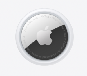
An AirTag, sure to stay with whatever you want to track, assuming you can find an accessory that’ll hold it securely.

Though announced last year, Apple’s AirTags were part of the rumor mill for years. Some have criticized them for not including more useful features, such as built in holes for key rings.

Recently, former Apple designer Jony Ive served as guest editor for the Financial Times’ “How to Spend It” issue. One article shares 12 of his top tools, and I couldn’t help but see something familiar in one of them.

Graf Von Faber-Castell platinum-plated eraser, £100, jacksonsart.com

That eraser sure looks like something else I’ve seen.

Non-Selectable Rows in a SwiftUI Picker

With SwiftUI, it’s quite easy to create forms to collect user input. Consider the following.

struct ContentView: View {
    @State var numberOfCookies: Int?
    
    var body: some View {
        NavigationView {
            Form {
                Picker("How many cookies?", selection: $numberOfCookies) {
                    ForEach(1..<10) { number in
                        Text("\(number)")
                            .tag(number as Int?)
                    }
                }
            }
            .navigationTitle("Order")
        }
    }
}

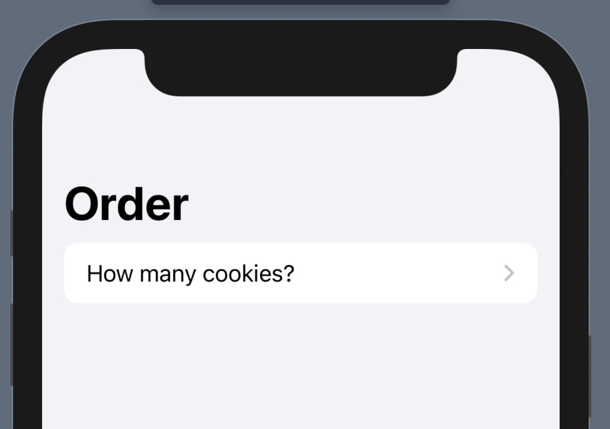
Being in a Form in a NavigationView means our Picker above will navigate to a list on tap by default. We thus get a view that looks like this.

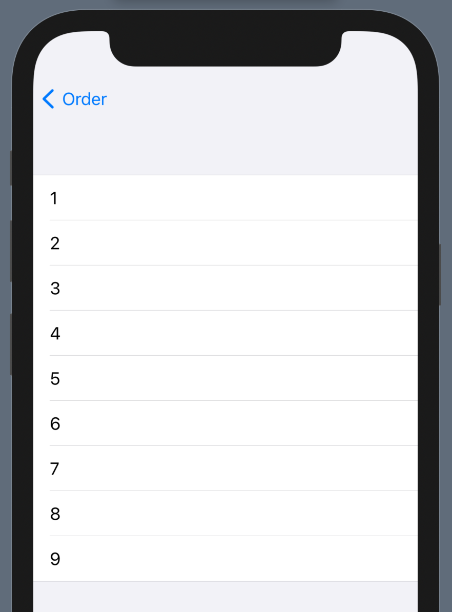
If they tap on the row, they’re shown this list of options.

The Picker will take each view generated in the ForEach and show it as an option.

This is super simple! However, what if we wanted to show some kind of header alongside our various options? Or perhaps we wanted to section the options? Or maybe we’re displaying options from a third-party API that includes such headers or section names in the returned data? To figure that out, let’s first understand how the SwiftUI picker works.

How Picker Works

The above code seems fairly straightforward. I defined a Picker in a hierarchy. It had a title that is displayed in the form. The selection was set as a binding to a local state variable. The trailing closure was my picker content, where I used a ForEach to generate each option.

However, as simple as that might be, you might be asking: What is with the tag?

Each view that is used in the Picker needs to be tagged with the value it represents. In our case, it’s just a number. So I am tagging each generated view so that it corresponds with a valid value.

But why didn’t I just say “.tag(number)“? It’s because it wouldn’t match the type the Picker is looking for, namely the optional Int of the state variable. If I had done that, the Picker would still show each of my numeric options, but none of them would be selectable. Tapping on one wouldn’t change the data source.

This leads to an interesting observation: Any view in the Picker that doesn’t have a tag matching the bound type is thus non-selectable.

Making Picker Headers

With this knowledge in mind, let’s go back to our example. Let’s say we wanted to show that we have a discount if the customer buys more than 4 cookies. How can we do it?

We change our picker like this.

Picker("How many cookies?", selection: $numberOfCookies) {
    Text("Normal Price")
        .font(.headline)
    
    ForEach(1..<5) { number in
        Text("\(number)")
            .tag(number as Int?)
    }
    
    Label("Discount", systemImage: "tag")
        .font(.headline)
    
    ForEach(5..<10) { number in
        Text("\(number)")
            .tag(number as Int?)
    }
}

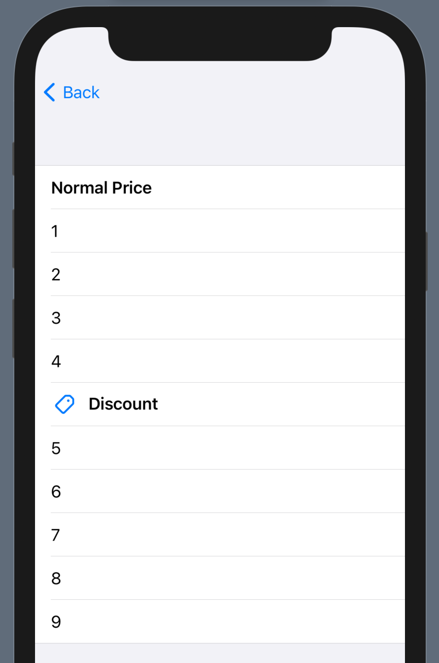
We now have other views in our picker that are not tagged as options, thus becoming visible yet non-selectable display items. In the above code, we first display “Normal Price” before showing options for quantities up to 4. We then show a more complex view, a Label, before showing the other quantities.

Our view now looks like this.

And just like that, we have support for displaying non-selectable content within our picker.

iPad: Pushing the MacBook forward

Ever since the iPad came out, there has been a growing question: Will the iPad replace the MacBook? Over two years ago, I put together my thoughts just after the third generation iPad Pro was announced.

Quoting from my own post:

Everyone is expecting iPad to replace laptops at some point in the future. But what exactly are they wanting?

It seems the expectation is that, if iPad is the future of computing, that we’ll eventually not need laptops (and maybe desktops) because iPads will replace the PC category for what we do. Thus, iPads need to eventually do everything current PCs can do and more.

As the iPad has become more capable, it seems to move closer to replacing the laptop.

However, Apple has said that their goal is not to replace the laptop. In that post, I quoted Phil Schiller in a 60 Minutes interview:

Charlie Rose: Is there danger of one product cannibalizing the other product?

Phil Schiller: It’s not a danger, it’s almost by design. You need each of these products to try to fight for their space, their time with you. The iPhone has to become so great that you don’t know why you want an iPad. The iPad has to be so great that you don’t know why you why you want a notebook. The notebook has to be so great, you don’t know why you want a desktop. Each one’s job is to compete with the other ones.

Will the iPad rise to tear down the MacBook, replacing it as the portable computer in Apple’s line up? Schiller’s words seem to be a resounding no. This, however, leaves us in an interesting quandary.

Strong Competition

For years, many have seen the iPad gain new features and come closer to being a laptop replacement. For some, it already has, replacing cheap PC laptops (or even MacBook Airs) used for email and browsing. The addition of the Magic Keyboard has made that an even better option than before.

This year, though, we’re facing something that we haven’t seen yet: The iPad line is on par with the latest Mac’s processing capabilities.

In November, Apple announced their new line of Macs running their own Apple Silicon. The M1 chip, based on the A14 (found in iPhone 12 and the 4th generation iPad Air), has brought increased battery life and performance to Apple’s lower-end Macs. The A14X, likely closer in performance to the M1, is said to be coming in the soon-to-be-released iPad Pros.

If that is true, we’ve now got an interesting product line up. We have the iPad Pro which, when paired with the Magic Keyboard, gives you a touch-first interface in a slim package that also provides great support for cursor and keyboard input. On the other, we have the MacBook Air, giving you a cursor/indirect-input-first interface without touch, also in a relatively slim package. However, inside, they’re both virtually identical: Whether running an M1 or an A14X, both are just as powerful, just as capable, just as performant.

The differences are few: One has touch, one does not. One runs macOS, the other runs iPadOS (essentially iOS with a different name). And… that’s about it. Sure, you have some features like Spatial Audio or Face ID to consider, but those could easily come to a future M1X/M2 MacBook.

Schiller said, “Each one’s job is to compete with the other ones.”

At this point, we are looking at an iPad Pro that easily competes with and, in a few ways, exceeds the MacBook line.

What will Apple do: Let the iPad replace the MacBook portable? Or will Apple stick to what they’ve said all along and make the MacBook compete?

I’m hoping for the latter. If that ends up being true, Apple has some truly awesome MacBooks in their product pipeline. I can’t wait to see them.

Thought experiment on upcoming Apple Silicon Macs

I’m not one to put a lot of stock into rumors. Occasionally, though, one comes across that gets me thinking. This was one of them.

There’s a lot of speculation there. One of those items caught my eye, though.

A15 is aiming for 30% speed improvement.

Apple is known for having the fastest phones thanks to their own silicon. Their chip team is fantastic, making an A15 with a potential 30% speed improvement over the A14 quite likely.

What impact would this have on the Mac, though?

The M1

In November, Apple announced the first Macs with their own silicon. The M1, based on the A14 chip featured in the iPhone 12 series and the 4th generation iPad Air, quickly gained a reputation for amazing performance for the amount of power required. It scored the highest single-core score on Geekbench, and while it was beaten in multi-core, it was no slouch, either.

While the A14 has a 6 core architecture (2 performance cores, 4 efficiency cores), the M1 has an 8 core architecture. The additional 2 performance cores no doubt help bring up the M1’s multi-core score and help make the latest Macs truly fast machines.

The M1 has allowed Apple to take beloved Macs like the MacBook Air and simultaneously:

  • Increase CPU performance by up to 3.5x over the previous MacBook Air
  • Increase battery life by 50% (from 12 hours to 18 hours)
  • Remove the fan

The MacBook Pro got similar improvements:

  • Increase CPU performance by up to 2.8x over the previous MacBook Pro
  • Increase battery life by 100% (from 10 hours to 20 hours)

While retaining the fan, many users report hardly ever hearing the fan in a MacBook Pro, nor feeling excessive heat from the device, even under heavy workloads.

The (Theoretical) M2

With everything Apple could bring because of the M1, what could the M2 provide? Where can our speculation start?

I’m going to start with the rumor quoted above.

If we assume the M2 will be based on the A15 chip, and we take the 30% improvement as a finality with the A15, I think we could safely assume such performance increase would come to the M2.

According to Geekbench scores, the M1 scores approximately 1700 in single-core and 7100 in multi-core. Assuming a 30% increase for the M2, I would assume that takes the single core scores above 2000 (and potentially up to 2200). Geekbench browser shows Hackintoshes with AMD Ryzen 9 5950X at that range, but I would assume these are overclocked. Regarding multi-core, assuming a more modest 20% increase (though I don’t see why 30% wouldn’t be possible), that gets the M2 up to 8500.

And an M2X?

This theoretical M2 is with the same 8 core architecture in mind. What if Apple made the M2 more than 4 performance cores?

While you can’t really just multiply your multi-core score by the number of performance cores, I’m going to do that just as a thought exercise. How close could Apple be to having their own silicon out-perform even their most expensive Mac?

First, let’s look at the current high end Macs. The (recently discontinued) iMac Pro was configurable up to an 18 core Intel Xeon W-2191B configuration. Its multi-core score is around 13,300. The Mac Pro’s base configuration is a 12 core Intel Xeon W-3235 scoring at 12,000. The highest Mac Pro configuration, with a 28 core Intel Xeon W-3275M, maxes out at just above 19,000.

Naively assuming doubling our performance core count would double our multi-core score, an M2X with 8 performance cores could potentially have a score of 17,000. That easily out performs the iMac Pro and takes us into Mac Pro territory. Should going to 8 performance cores not double our multi-core score, however, I do think an M2X would still beat out the iMac Pro easily.

Whether or not we see a Mac Pro this year with Apple Silicon, I think Apple is easily on their way and will definitely complete their 2 year transition on schedule. By the time it’s done, I feel we will see the following configurations:

  • M# – 4 performance cores, 4 efficiency cores. Focused on the ‘lower end’ of the Mac spectrum (MacBook Air, Mac mini). Easily outperforming today’s Intel-based Mac portable line.
  • M#X – 8 performance cores, 4 efficiency cores. Used in the MacBook Pro and iMac lines. Potentially outperforming anything up to (and maybe including) today’s Intel-based Mac Pro.
  • M#Z (or some other identifier) – 12+ performance cores, 4 efficiency cores. Mac Pro option, providing amazing performance with less power consumption, easily replacing the current Mac Pro.

I was personally impressed with the M1 Macs that were announced. When it becomes time for me to get a Mac (likely with an M2), I know I will be thoroughly pleased with its performance. The Mac’s future is very bright at this point.

The “iOS device supporting the most OS releases” is…

Over four years ago, I wrote an article that talked about device longevity and support. I started by talking about the iPad 2.

In March 2011, Apple unveiled the iPad 2. It was thinner than the original iPad, included both a front and rear facing camera, and packed the Apple designed A5 chip. While not incredibly more powerful than iOS devices sold in the previous year, the iPad 2 currently holds an incredible distinction: it supported six iOS releases! Only now, five years after introduction, is Apple letting the A5-family go. It launched with iOS 4.3.5 and will end with iOS 9.3.5, the most current stable release of iOS.

Apple continues to support their devices longer than other smartphone or tablet manufacturers. The iPad 2 certainly wouldn’t come close to the performance of today’s iPads, but it had the power to support six iOS releases!

Something I also noted at the same time:

iOS 9 stands as a unique iOS release: it is the only first major iOS version to not drop support for a device. In other words, all iOS 8 capable devices were able to get iOS 9. Given these recent trends, it’s likely that a good number of iOS devices, especially the 64-bit ones running the A7 chip or newer, will be supported by iOS releases for years to come.

Since I first wrote that, we’ve seen two other iOS releases that also didn’t drop support for the previously supported devices.

  • iOS 12 supported all of the same devices as iOS 11, though the iPhone 5s and iPhone 6 had limited support due to lower RAM specs.
  • iPadOS 14 supported the same iPads as iPadOS 13. (iOS 13 dropped the A8-family of devices, while iPadOS 13 kept supporting the A8 equipped iPads, likely due to the increased RAM on those devices)

What’s the result of those OS releases on device support? The iPad 2 no longer has the crown for the most number of supported iOS releases. Other devices have since had that same distinction. (Specifically the iPhone 5s, iPad Air, and iPad mini 2 supporting iOS 7 through iOS 12). But there’s one that’s done even better:

The iPad Air 2!

The iPad Air 2 was released in 2014 and initially supported iOS 8.1. The A8X chip inside continues to handle recent updates, and the device current runs the lastest iPadOS version (14.4 as of writing). That means it has supported seven major OS releases!

If Apple is willing to have a tablet with the power of an A8X chip live for that long, how long could the devices we see now be useful? A phone or tablet isn’t made useless just because it stops getting updates. Even if we use it until it’s no longer supported, seven years is quite a long time between purchases.

Back to my iPad 2 thoughts:

That all said, I’m sure any iPad 2 owner can tell you: The device ran smoothest with iOS 4 and slowest with iOS 9. But given that each release adds new features of some kind, it’s only an eventuality that hardware cannot keep up with the software running on it. But to support major OS releases for six years is quite a lot, at least in the mobile space. Apple, thankfully, has the advantage of controlling both the hardware and software that goes into their devices, allowing them to tweak and manage every aspect. Because of the limited hardware options, it’s also easy for them to maintain support for older devices if need be.

Despite how people feel about Apple and their devices, there’s little people can say regarding device longevity and support. No one in the industry does what they do.

I’m now very curious how long the current generation of Apple’s devices and chips (especially the A14 and M1) will be supported.