SwiftUI menus are extremely useful. When you are showing a Button in a Menu, there are a few ways to style it. However, it may not always be obvious.
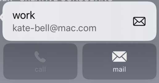
For example, let’s say I want to replicate the appearance of this button in the Contacts app. It has a title, a subtitle, and a trailing icon image.

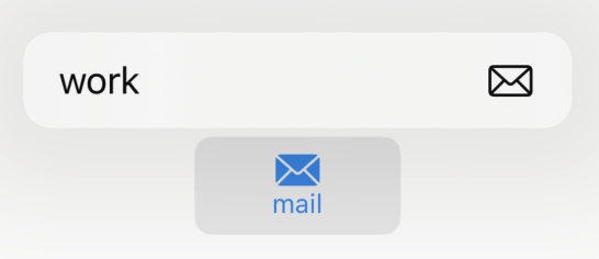
At first glance, you may build something like this:
Menu {
    Button { /* Action */ } label: {
        HStack  {
            VStack {
                Text("work")
                Text("an.email@address.com")
            }
            Image(systemName: "envelope")
        }
    }
} label: { /* The "mail" button */ }However, you’ll quickly see that this is not correct.

While your label in normal circumstances might appear as you’d expect, the menu’s buttons seem to work by mirroring the underlying content. We can imply this by the way the image appears at the trailing edge of the button and not next to the text like our (misaligned?) HStack would suggest.
We see similar behavior if we change our button’s label to use an actual Label type.
Label(
    title: {
        Text("work")
        Text("an.email@address.com")
    },
    icon: { Image(systemName: "envelope") }
)Again, we see the same output as above.
So what can we do differently? If the image is “magically” being picked out and put in the right place, then perhaps there’s other magic happening in the Button. In fact, this turns out to be what is happening. Let’s update our button once more:
Button { /* Action */ } label: {
    Text("work")
    Text("an.email@address.com")
    Image(systemName: "envelope")
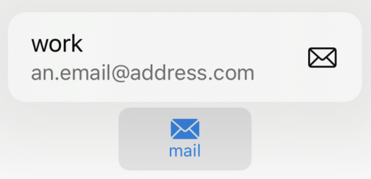
}Now we’re not specifying anything about text layout or even where the image should appear. Yet, what is our result?

There is definitely some underlying mirroring happening to pull out each view and put them in their proper place. In fact, if you were to put the Image before the second Text view, you end up with the same output! Thus, this does appear to be what is happening.
In short, if you want to have your menu’s button appear like a contact’s mail or phone buttons, use the following template:
Button { /* Action */ } label: {
    Text("Title")
    Text("Subtitle")
    Image(systemName: /* The icon */)
}